MPIC
Medical Provider to Interpreter Connection
Mitigating language barriers in healthcare settings to provide equitable medical attention to all patients.

The problem
With over 400 languages spoken in the US alone, MPIC aims to connect medical providers to qualified medical interpreters to insure all patients have access to equitable medical care.
Goals
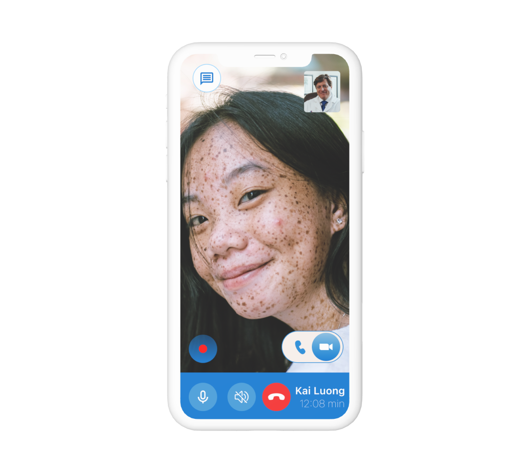
Connect providers to interpreters in real time.
Allow providers to schedule a call with interpreters.
Provide training materials for interpreters of all levels and experience to insure credibility.d
Research & Analysis
Online secondary research was conducted to gather general information about what methods of interpretation providers are currently using. Findings inspired the need to incorporate real life interpreters into the design.
Primary research involved interviewing 5 participants to see how real medical providers are handling the problem today. Interviews taught me that most medical providers need interpreters instantaneously rather than having the time to plan ahead.
Personas
Personas were developed to further understand providers’ goals and pain points.
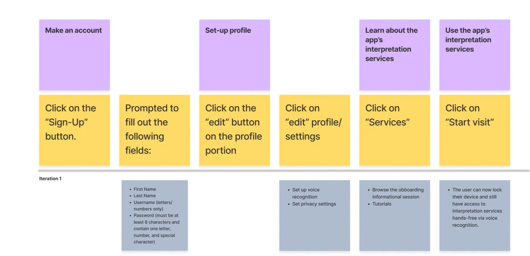
User Story Example
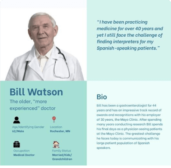
Say “hello” to Bill!
He doesn’t exactly know how to use his iPhone and identifies as more of a “people person”. For this reason my goal was to create an easy-to-use product that allows 24/7 access to interpreters.
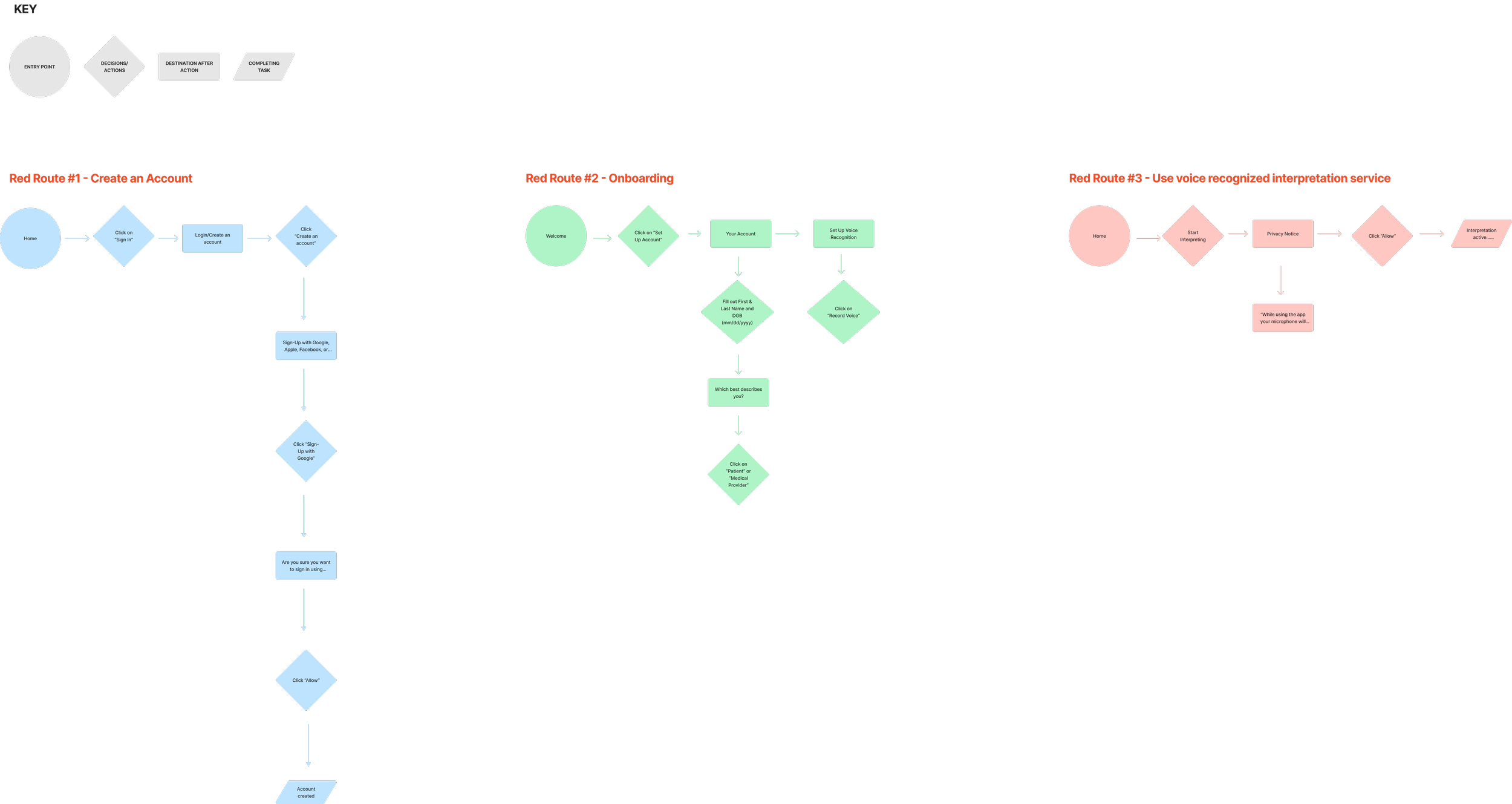
User Flow Example
Ideation
I elected to use a variety of brainstorming techniques like laddering and visualizing solutions to ideate resolutions to the designated problem.
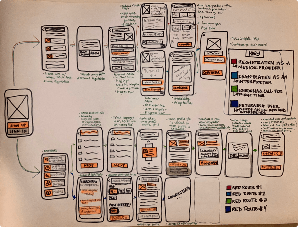
I ultimately created a solution sketch for each screen of every red route. Guerrilla usability tests were conducted before moving forward. Participants revealed navigational difficulties while working through assigned tasks. This is why I opted to design a navigation component that is implemented on each page for increased ease of use.
Interface Design
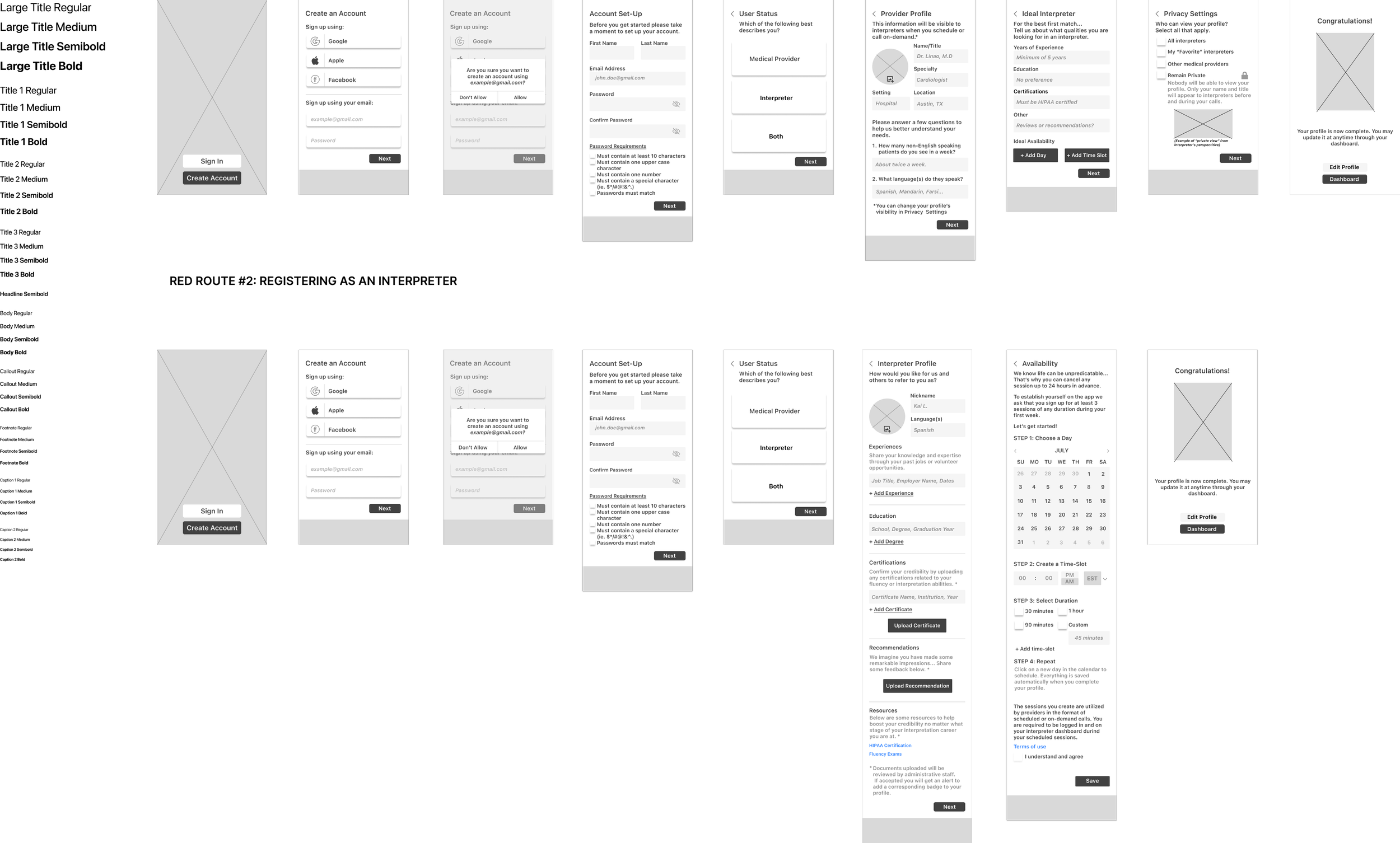
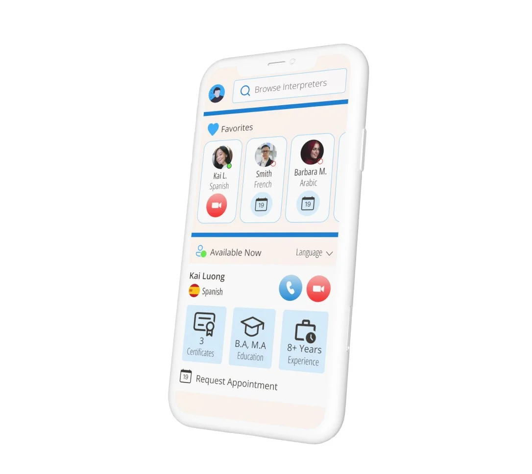
By creating wireframes I was able to analyze the importance of each screen and insure each one has a sole purpose and clear visual hierarchy.
Primary Color
Blue was selected as the primary because it promotes a calm attitude and is associated with cleanliness.
Secondary Color
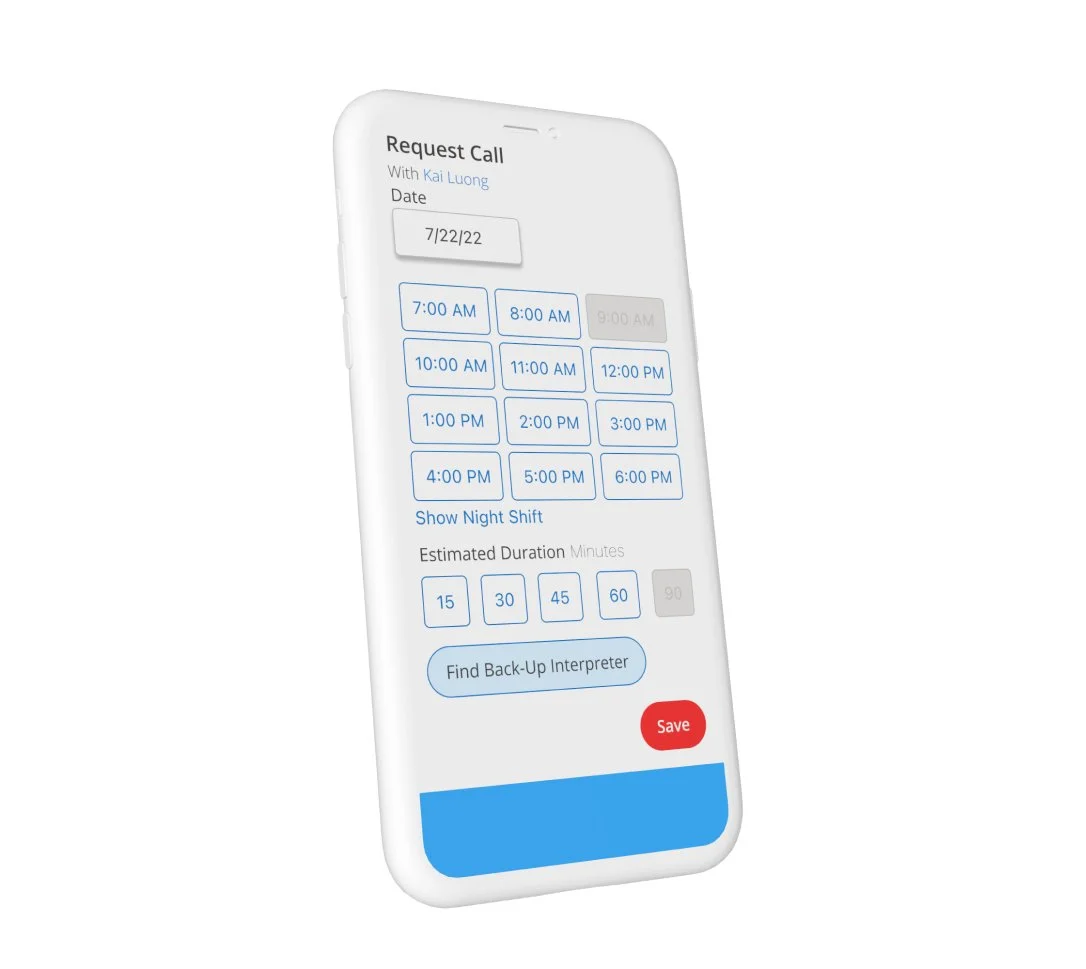
Red is the attention seeking color psychologically. When applied properly in design, the right hue of red helps guide the user through tasks in an encouraging rather than alarming manner.
Beige
The 60%, 30%, 10% color rule was applies with beige being used as the base white (60%).
Iconography
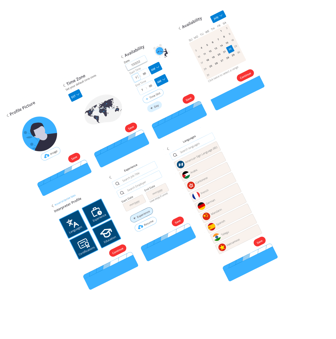
Lined icons were selected for complicated concepts such as certifications, education, and experience. On the other hand, I used more bulky solid icons when actions were possible such as audio or video call, or uploading.
Future Iterations
Users would like to be able to message the interpreters they’re working with before, after, and even during calls.
Develop the interpreters’ side of the product by including training and education resources and a dashboard unique to their needs.
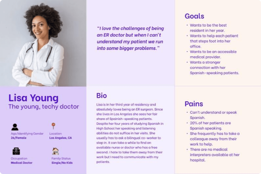
Meet Lisa!
Lisa uses tech like a super power while working however at times her devices can become distractions. I aimed to create a product that allows her to be present and hands-free with her patients.
User Flows & User Stories
Imagery
Illustrations were used in place of photographs to keep a clean color scheme and stay on theme with other medical and healthcare products on the market.
Validation & Conclusion
Two rounds of five moderated usability tests were conducted. Ultimately, these sessions helped tune out problems with visual hierarchy and the overall flow of the tasks.

Affinity maps were created for thematic analyses and helped reveal themes at large such as: technological products becoming distractions in appointments therefore the ideal product would be hands-free and out of sight during the visit.
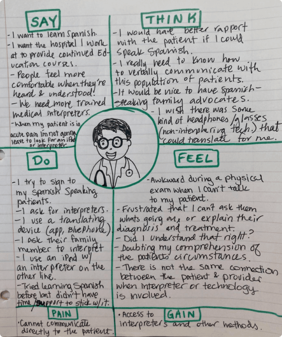
Lastly, an empathy map was sketched out to identify the medical providers’ thoughts, emotions, and pain points during appointments with patients who do not speak English. The end all was that I wanted to help providers regain their confidence in the application of the knowledge no matter the patient or language barrier present.
These two methods were used to learn more about what steps and actions users would need to take to complete red routes on with the product. This is an essential step before ideating solutions to the problem.
Low-Fidelity Designs
By creating wireframes I was able to analyze the importance of each screen and insure each one has a sole purpose and clear visual hierarchy.
Color Palette
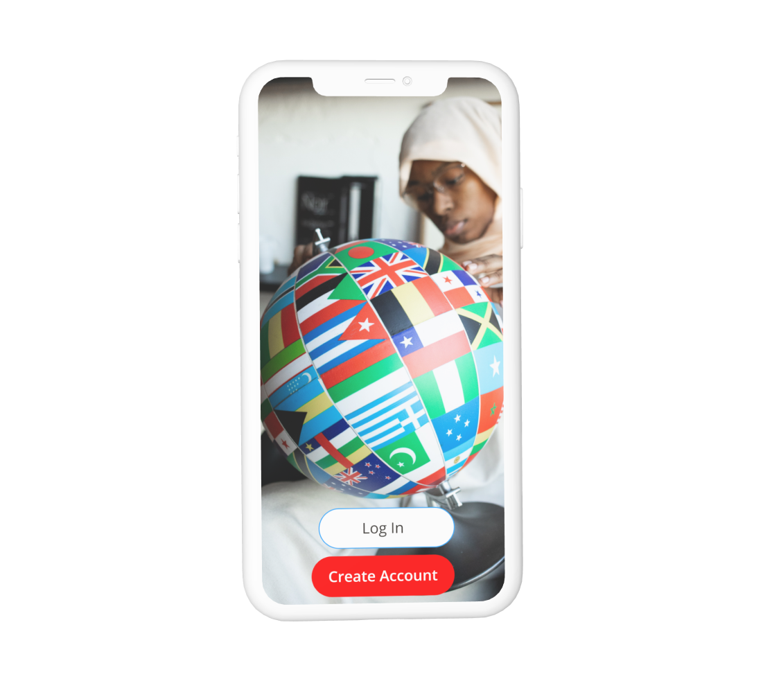
Brand colors were pulled from the most common colors found on national flags around the world.
Flags are displayed in various locations throughout the product as visuals accompanying languages therefore it was important the brand’s visual theme was harmonious with the vast majority of flags.
Button Groups
A single screen on MPIC can contain the primary, secondary, and tertiary buttons.